If
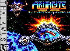
you're talking about classic shooters on the C64, the name 'Armalyte'
will show up very frequently. Everyone seems to love this game.
Everyone except for me, that is. Really, I never understood all
this excitement about Armalyte in the first place and I still don't
understand it today. But now, let's have a closer look at the game.
Armalyte
is the official sequel to 'Delta', but gameplay-wise, there are
not many similarities between the two of them. Two players can play
Armalyte simultaneously. Solo players get an option device attached
to their ship, which is very useful, because it increases your firepower
and at the same time it can be used as a shield against enemy bullets.
Extra weapons are pretty basic in style. There's only side and rear
guns and an improved front vulcan to be collected. A super weapon
can be fired by holding down the fire button, but after that it
takes a while until it recharges itself again. So there's not very
much in the gameplay department which is new or extraordinarily
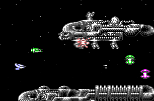
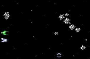
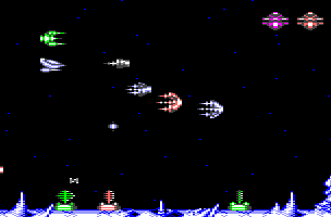
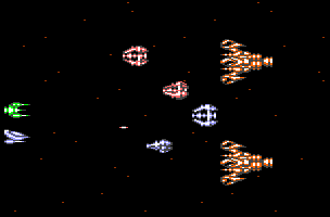
well done. Enemies attack in chaotic formations and from all sides.
If you're used to the more structured gameplay of the average Japanese
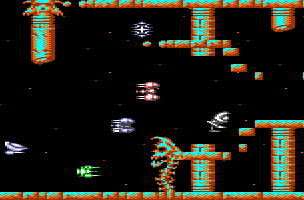
shooter, this causes quite some irritation. Additionally, the colours
of the enemy ships are not very tasteful. Often, there are bright
green or even pink ships in a formation, which gives me the feeling
I'm fighting some sort of space candy.
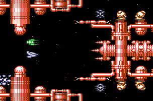
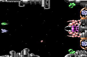
The
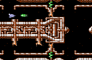
colours are definitely the main problem of the game, at least in
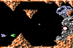
the graphic department. The designers defined about ten different
colour palettes. Each level uses three or four of them, but not
simultaneously. Instead they are used one after the other. Let me
give you an example: Level one starts out being all blue, then it
changes to be completely red, then orange, then green and finally
it becomes grey. During each level, you are presented the same graphic
elements in severeal different colour schemes. This odd cycling
through the colour palettes takes away a lot of the uniqueness of
the individual levels, as it gives you the feeling you're playing
the same level over and over again. Worse yet, some of the colour
schemes are pretty ugly. I would have preferred it much if every
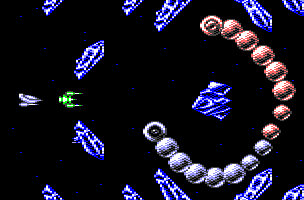
level sticked to one shade all along. The graphic artist obviously
loved the graphics of 'Io' (the one-eyed snakes are stolen from
that game), but he failed in trying to recreate their astonishing
look. His palettes are somewhat flat compared to the very fine and
stylish designs of Io.
The
sound is mediocre at best. The title tune is average. During the
game, there's no music at all, just a couple of sfx, which are not
too exciting, either.
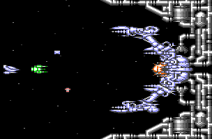
The
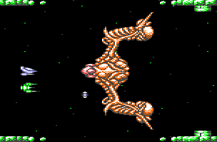
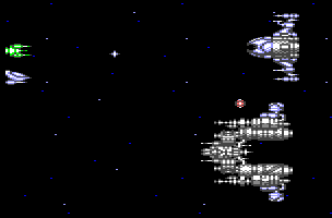
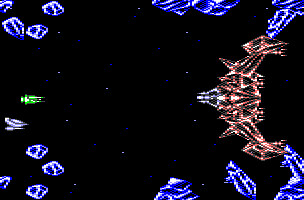
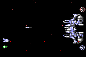
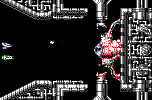
boring bosses are another major flaw of the game. Not only do most
of the bosses and minibosses look the same, they are also very easy
to defeat. They just move a little back and forth and occasionally
shoot some bullets. It's easy to dodge their attacks, but still
it takes ages to kill them, as they take so many hits. I hate that.
What
more? The collision detection, while being generous if the background
graphics are concerned, tends to be pretty unfair in the case of
sprite/sprite collision. But the one thing I hate most about Armalyte
is that exploding enemies actually stay in their formations and
their explosions follow the very path the ship would have taken
if it hadn't been shot. The explosions are always of the same colour
as the ships, so it's often hard to tell which ship is blowing up
and which one is just badly animated. Very often, you'll end up
crashing into the background while trying to avoid enemy ships you've
already taken out. This sucks so much, I can barely clad it in words.
Overall,
apart from the two players mode and the ending sequence, there's
not very much I like about Armalyte. It falls short on every aspect,
be it graphics, sound or gameplay. If this isn't the most overrated
game in shmups history, it must be at least among the top ten. Don't
take me wrong: Armalyte is not a bad game, but it's in no way the
classic everyone seems to so excited about.
Now
I think I'll throw my Armalyte disk out the window and play game
of 'Io' or 'Katakis' instead.


